Driving the Future: Enhancing Filters for a Seamless Search Experience
Project
Search filters redesign in apps
Role
User Experience Design
UI Design
Research plan
Team
Product designer
PM
App developers
UX Researcher
Data analytics
where
AutoScout24
year
2021
Introduction
AutoScout24, a popular online platform connecting car buyers and sellers, aims to provide a seamless and user-friendly experience for individuals in their quest to buy, sell, or research vehicles. The platform focuses on empowering experienced and non – experienced users with comprehensive information and tools to make well-informed decisions.
Enhancing Search and Filtering
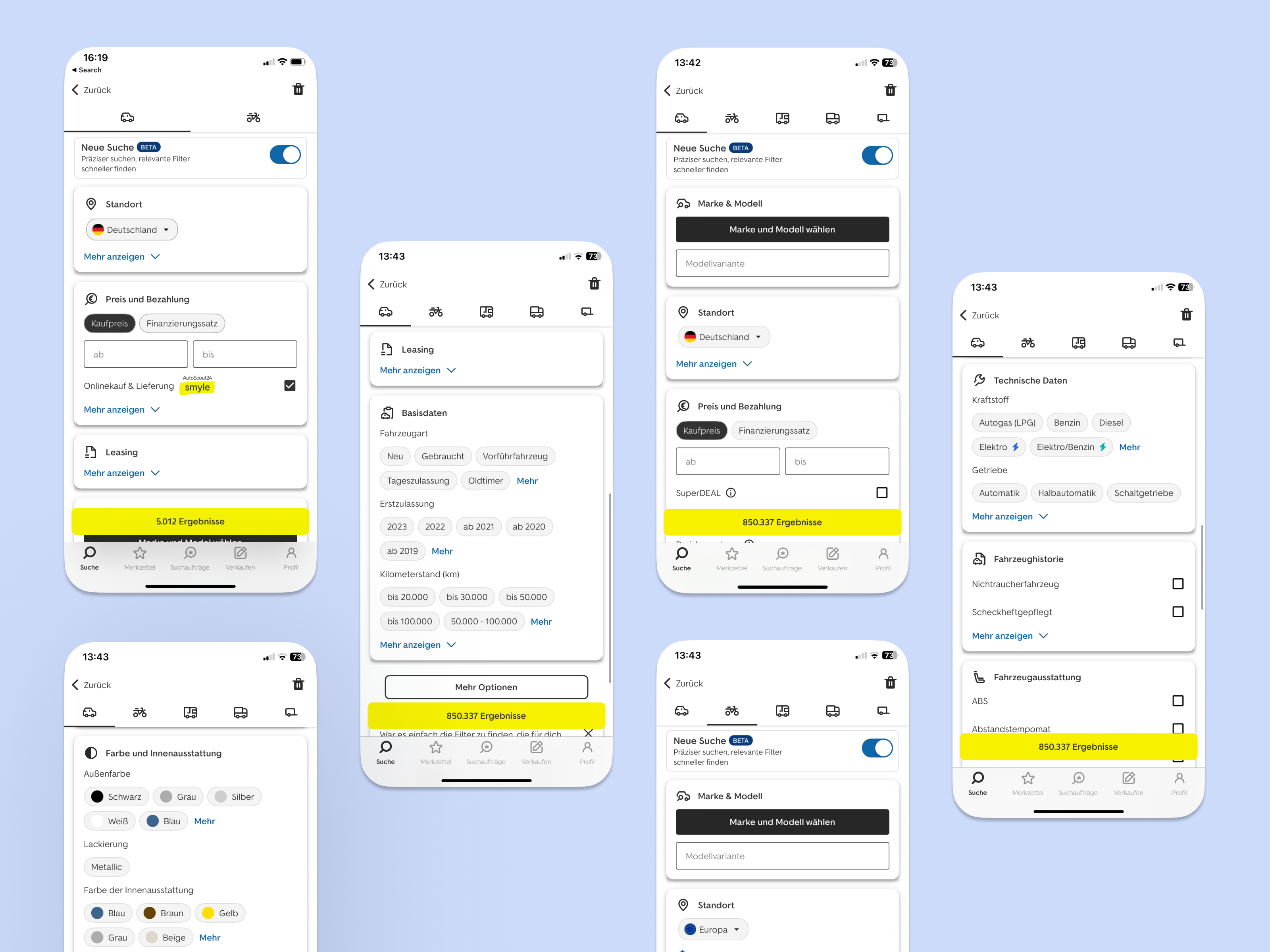
A key aspect of AutoScout24’s functionality is its advanced search and filtering capabilities, enabling users to swiftly find their desired vehicles. The platform allows users to apply filters based on brand, model, price, mileage, location, and more, facilitating effective narrowing down of choices. Recognizing the growing prominence of mobile devices in the search phase, AutoScout24 has prioritized a great mobile user experience.
In response to user feedback, the Android Connect team recognized the need to revamp the search function within the app. Users expressed dissatisfaction with the current state of search, citing concerns such as outdated design, lack of intuitiveness, and time-consuming navigation. To address these issues, the team embarked on a mission to transform the search experience, aiming to make it more modern, intuitive, and user-friendly.
By undertaking this redesign project, the Android Connect team endeavors to enhance the overall usability and satisfaction of users interacting with the search function. The ultimate goal is to create an enjoyable and efficient search experience that aligns with AutoScout24’s mission of becoming a trusted and go-to platform for individuals looking for their next vehicle.
User Problem
The existing search function in the AutoScout24 Android app presents several challenges for users, leading to frustration and dissatisfaction. In app stores reviews and as feedback in other usability tests, users have reported the following issues:
- Outdated Design: The current search interface lacks a modern and visually appealing design, which makes the overall user experience feel outdated.
- Lack of Intuitiveness and Time-Consuming Navigation: Users find it difficult to navigate and interact with the search feature due to its unintuitive design. The process of refining search results and finding specific vehicles is time-consuming and cumbersome.
- Non-User-Friendly Experience: The search function fails to provide a user-friendly experience, hindering users’ ability to efficiently search for cars based on their preferences. This lack of user-friendliness prevents users from fully utilizing the potential of the search feature.
The old search design
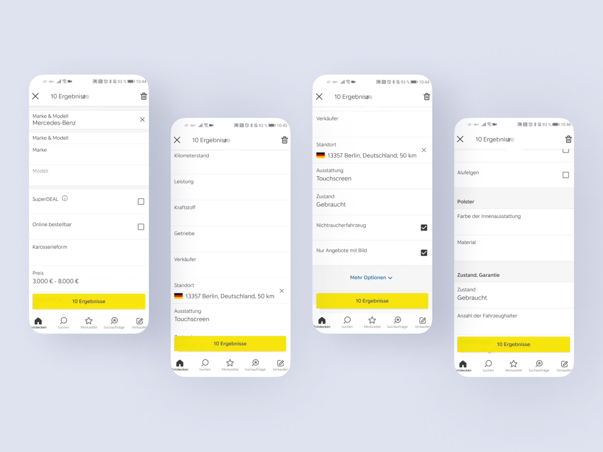
Context
The process began with an initiative driven by the web team, which involved gathering insights from existing surveys and a filter card sorting. After the card sorting results that had as an outcome the creation of filter groups, the web team ran an initial usability test of the regrouped filters.
The feedback of the new filter order was positive and recognizing the opportunity for improvement, I took the initiative and assumed leadership of the project within the Android team – as this was my main team.
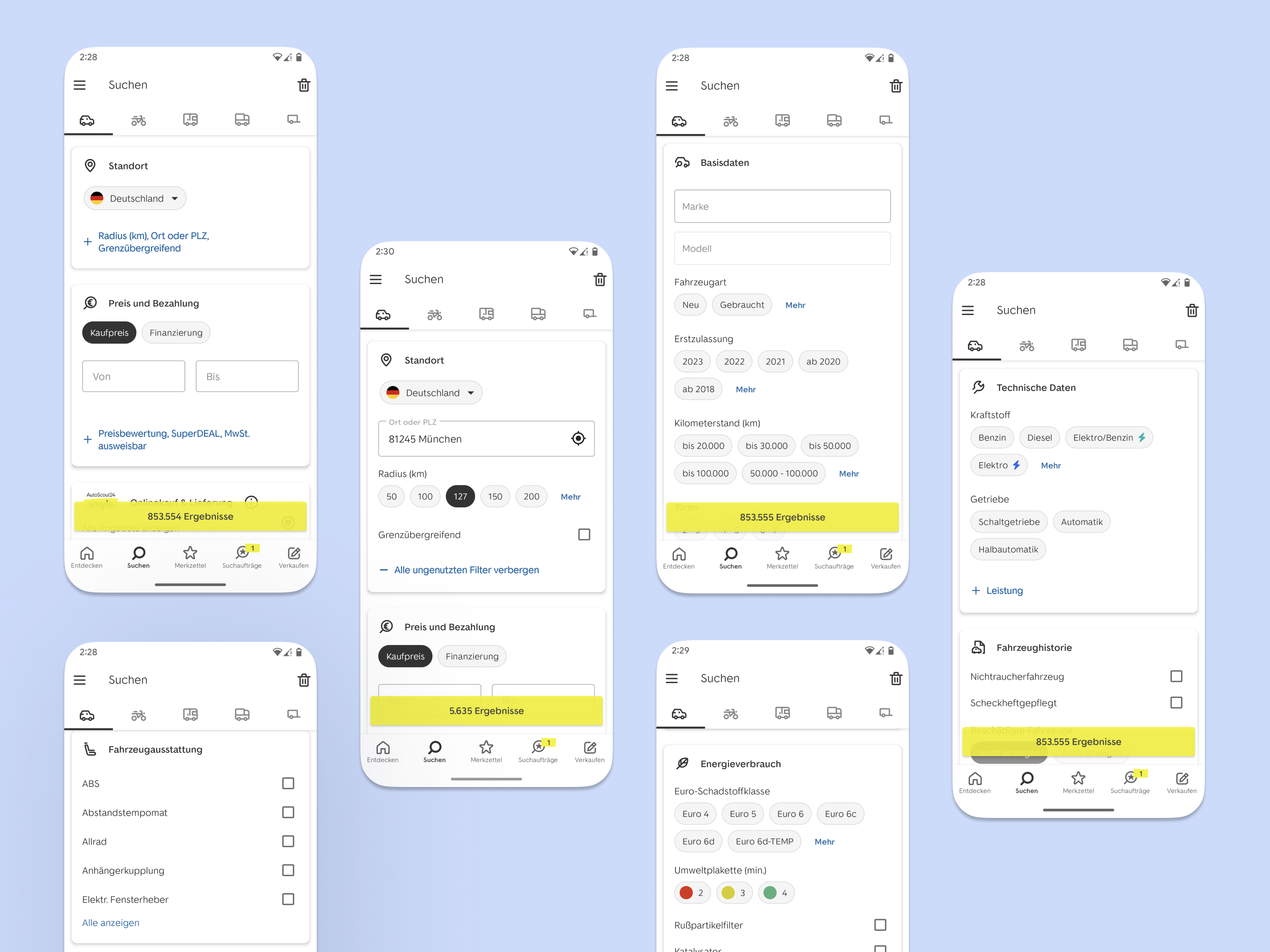
Redesigning the user interface and exploring new components
To build upon the positive outcomes of the filter regrouping, my first step was to redesign the user interface.
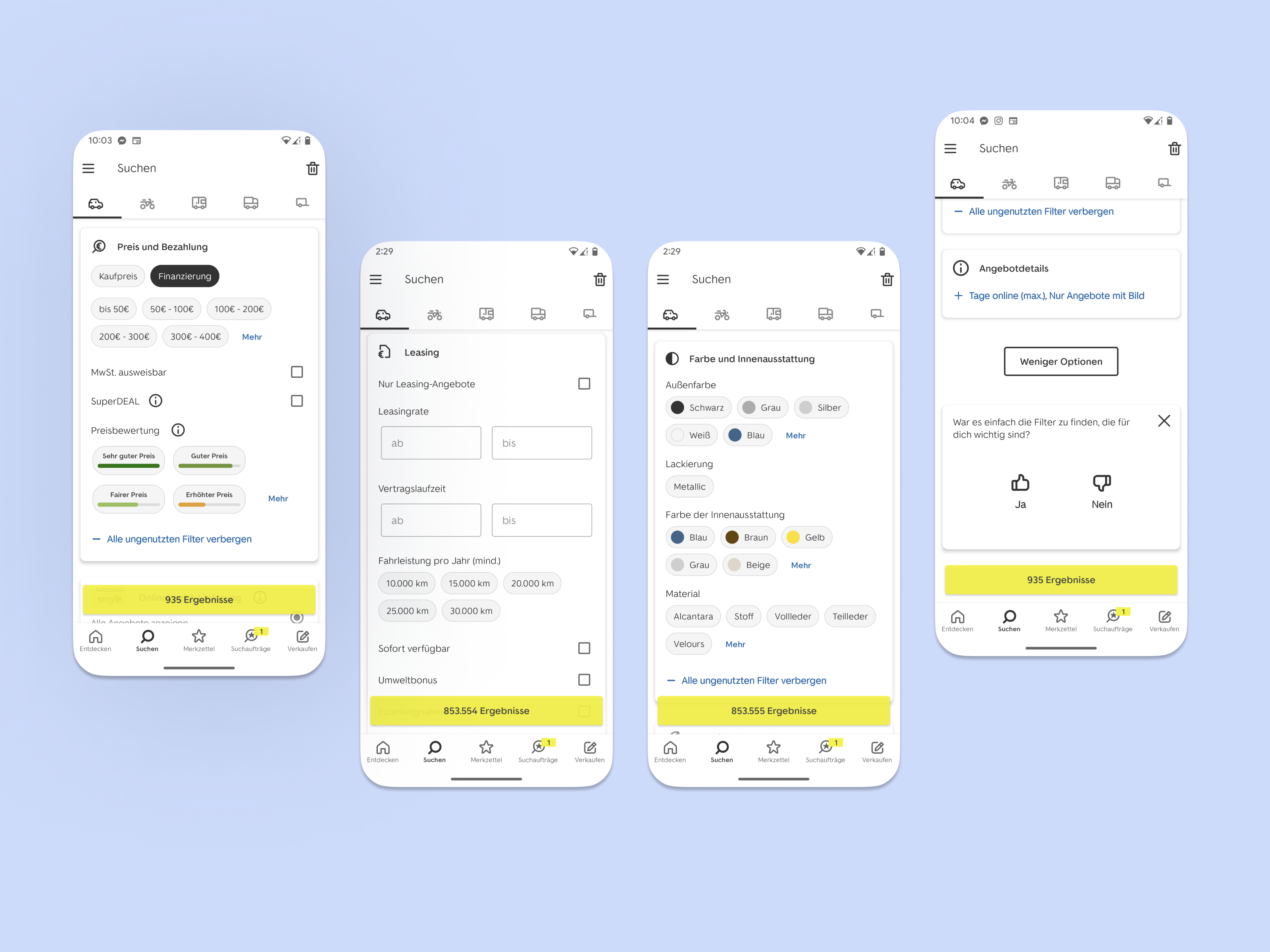
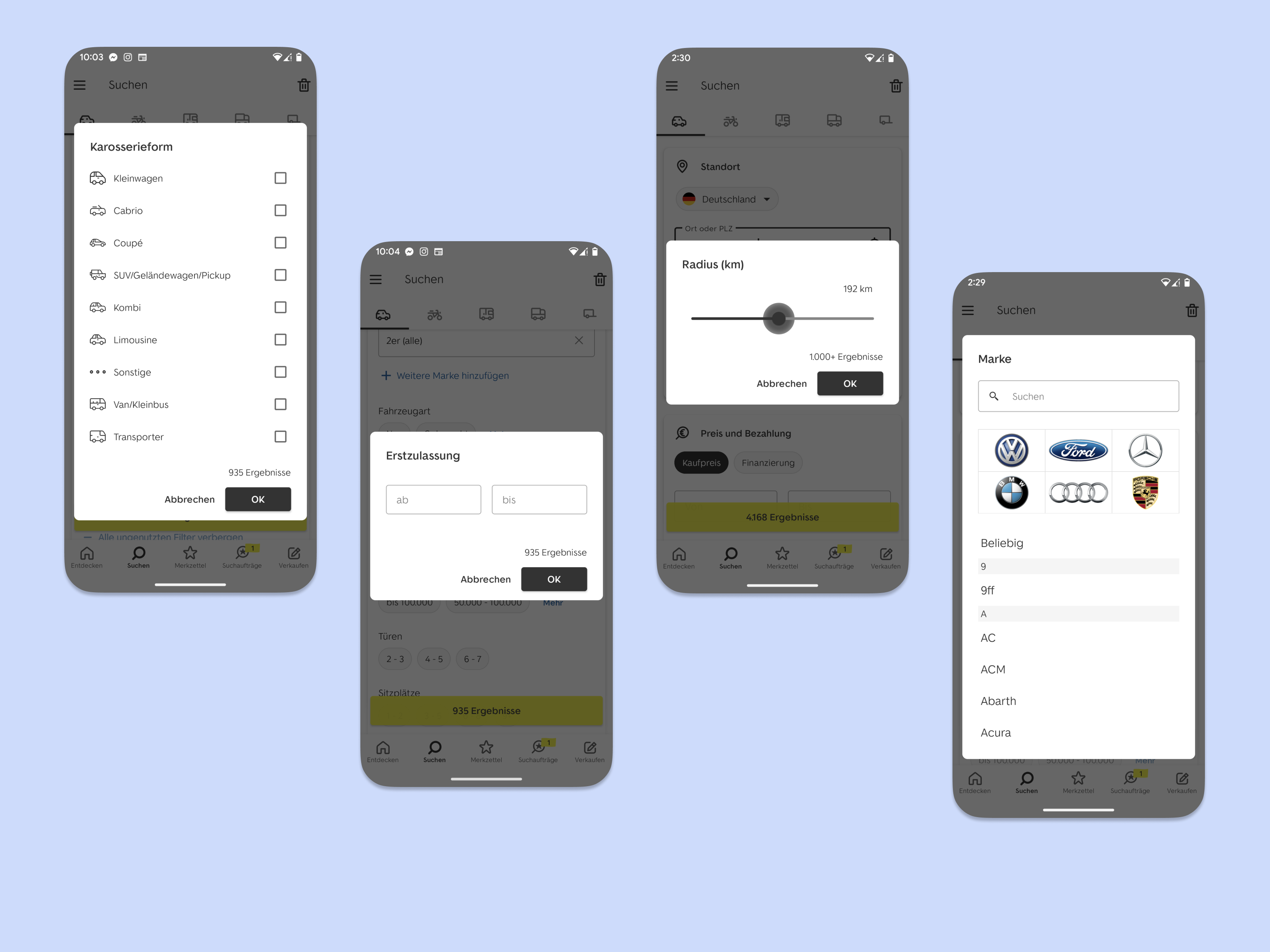
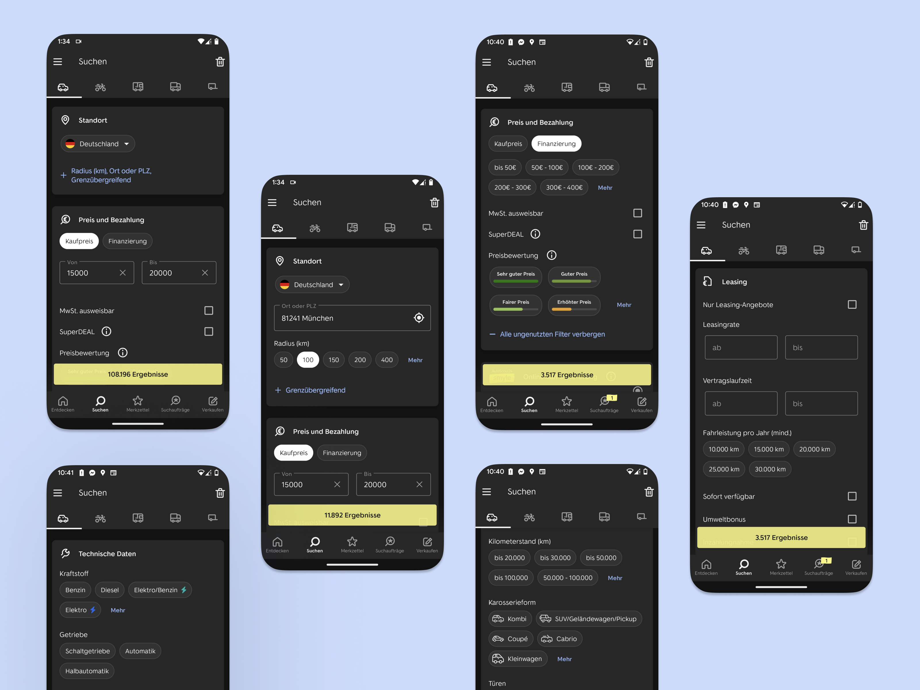
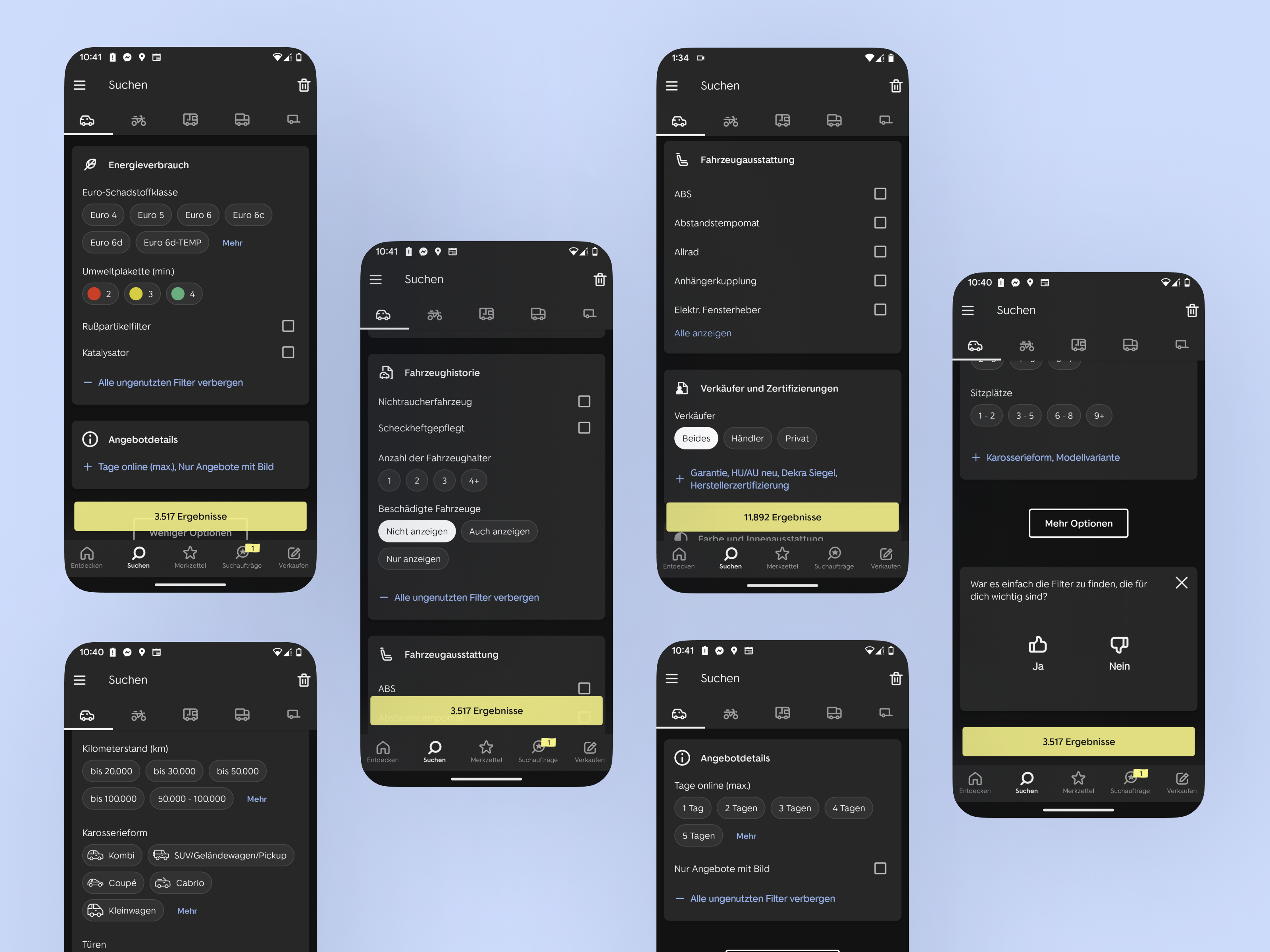
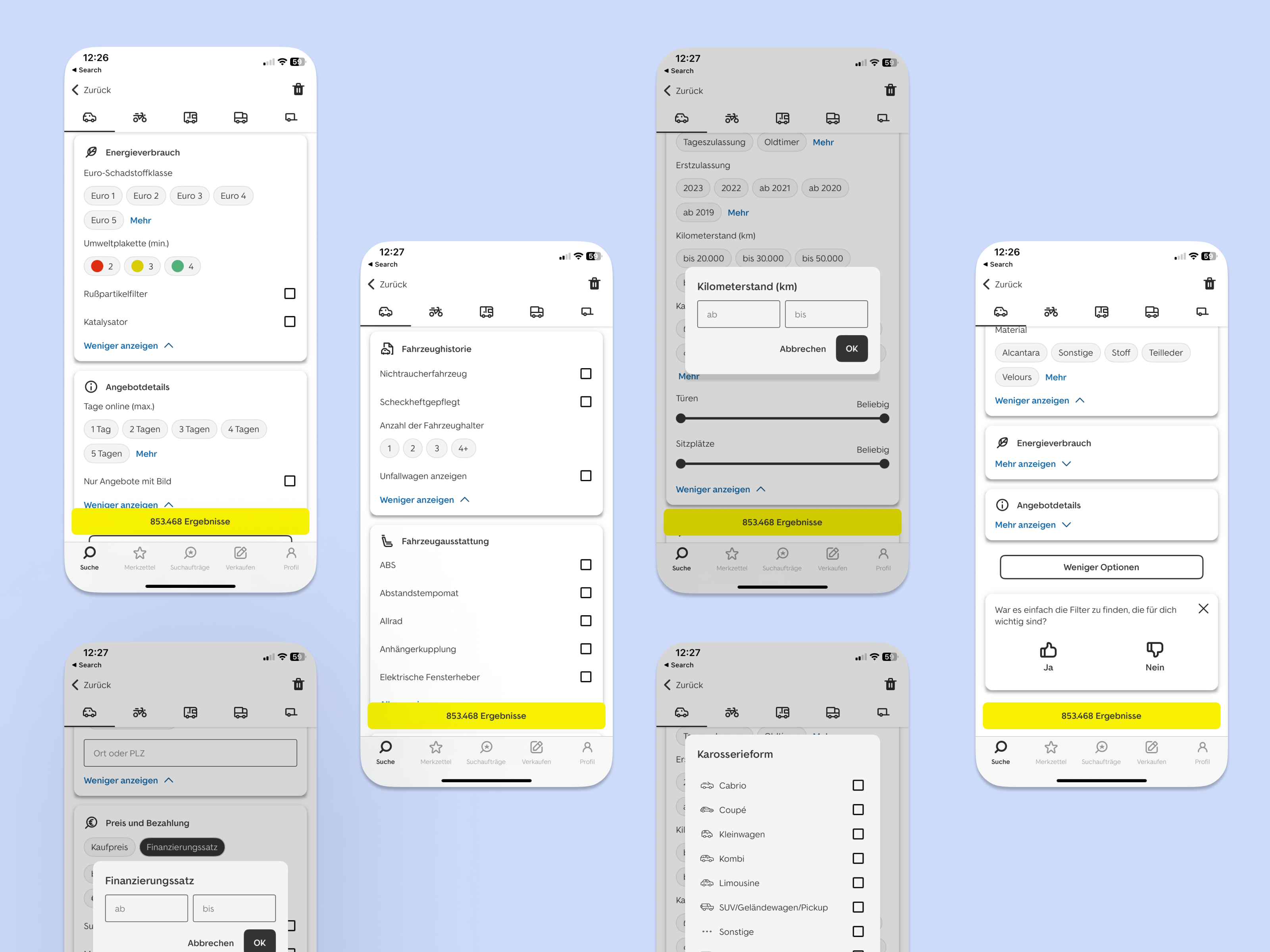
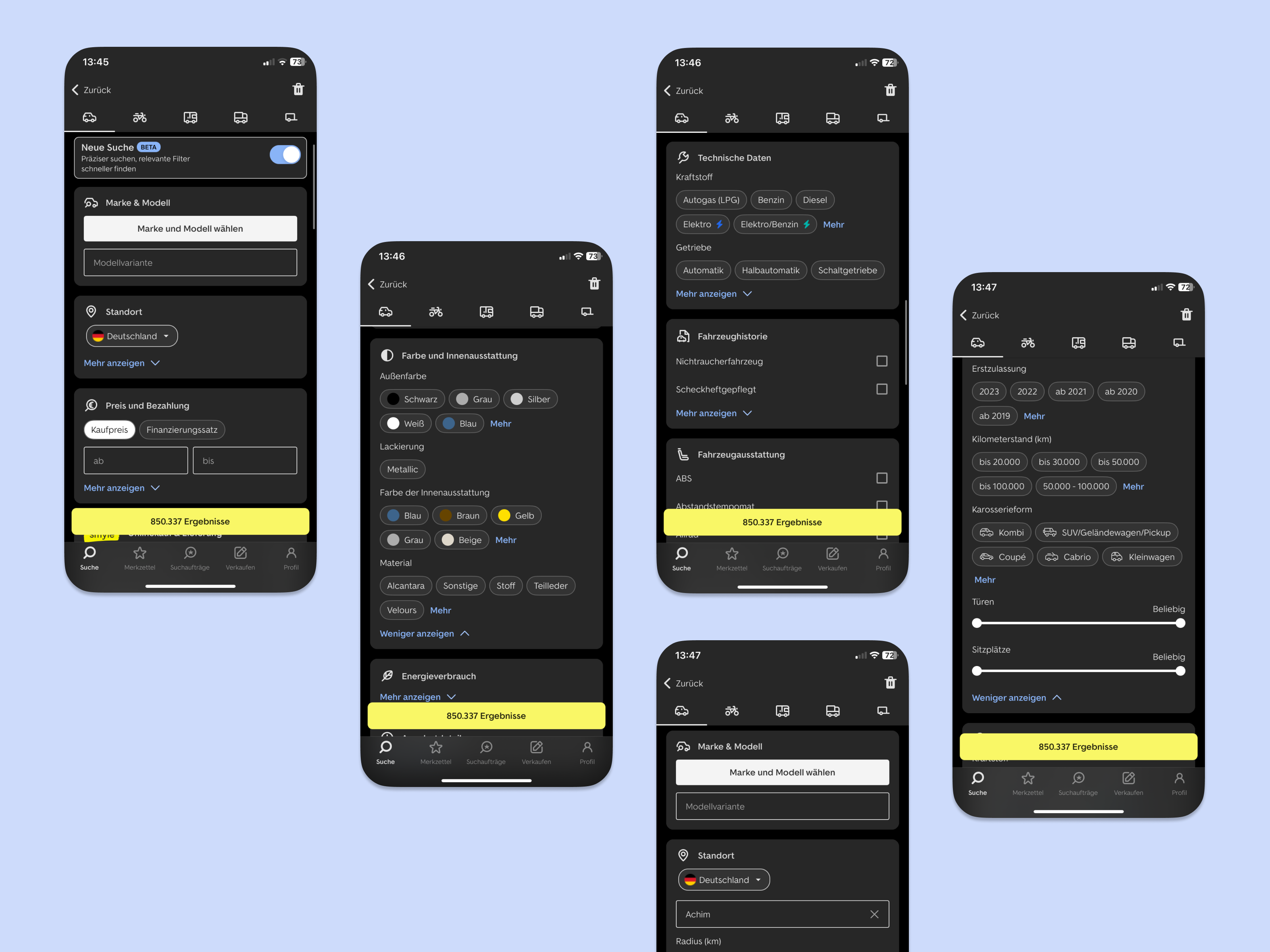
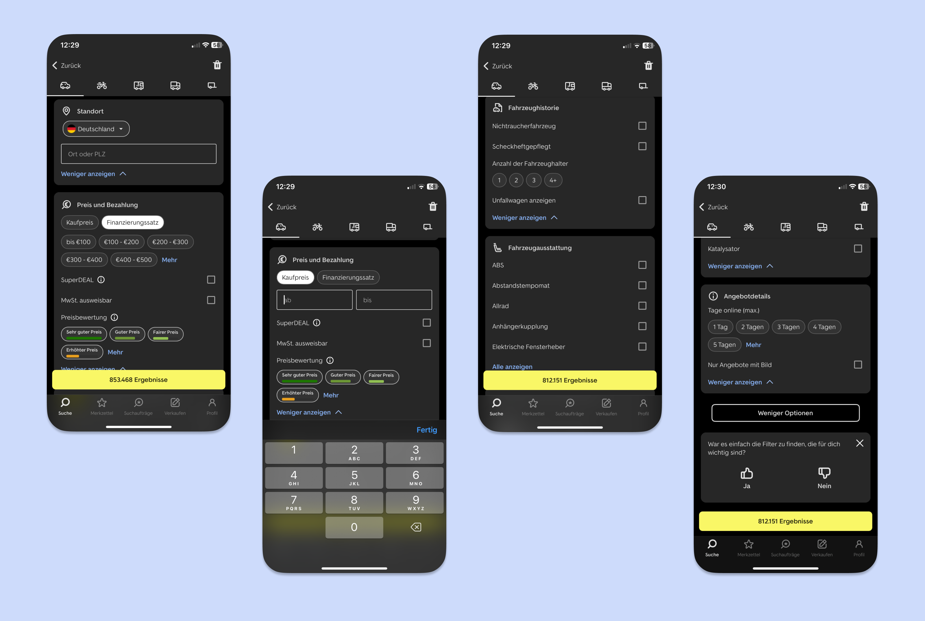
Following the principles of material design, I worked with card design for the different groups, I explored new components for single and multiple selection, ultimately deciding to introduce the chips component for these use cases. Additionally, I aimed to enhance the user experience by exploring the use of sliders for range-based filters, rather than traditional text fields.
Addressing filter overwhelm
Addressing the issue of filter overwhelm, I devised a solution to prioritize primary filters while allowing users the option to expand and access secondary filters within each group. To ensure users were aware of hidden filters, I added filter names to the button that exposes the secondary filters.
Data analysis to improve efficiency and guidance
To streamline the decision-making process and make it more efficient for our users (experienced and mostly the non-experienced ones), I proposed the idea of exposing the most popular options of each filter. To implement this, I requested a data analysis of the top 10 most frequently searched ranges and options for various filter categories, such as mileage, price, first registration, power, equipment, exterior colors, interior colors, fuel types, vehicle condition, body types, and location radius.
Moderated usability test in live app and prototype
Gather user feedback by conducting moderated usability tests with live app and prototype
Apart of the available research and insights, I felt it was important to gather fresh and firsthand feedback specifically related to the Android filters. Working alongside our UX researcher, we introduced a new user recruitment method within the app to ensure that we obtained feedback from engaged users actively searching for cars.
To comprehensively evaluate the impact of the redesigned filters, I planned and conducted moderated usability tests with 6 participants, utilizing both the live Android app and a prototype built in Maze. 3 participants started with the Maze prototype and 3 started with the app and then switched.
The method was “Fly on the wall” while executing tasks on Maze and in the app. Only during the last task in the Maze prototype, we gathered qualitative feedback by asking participants specific questions.
By testing the same set of tasks in both environments, we were able to compare the performance and user experience of the old and new filter designs.
The Maze platform provided valuable metrics, including task completion rates, average time spent on tasks, user flows, heatmaps, misclicks, and bounce rates.
Main research goals of the tests
- Time to find the filter
- Time spend on each task to adjust the filters
- Generic impression on the new look of the filters
- See if users need more info for some filters
- Test the new user flow against the old one to confirm the design change
- Make it easier for people to complete goals in less time
<span data-buffer="">The questions that I put together for users to complete both in the live app as well as in the Maze prototype
- Find cars in your city and max 50 km away
- Price between 5,000€ to 8,000€
- You are interested in Mercedes-Benz and Volkswagen cars
- Now remove the Volkswagen option
- You want a used car
- You want a car with touch screen
- You want a non-smoking car
- From a scale of 1 to 5 with 1 being not easy and 5 very easy, How easy was it for you to find and adjust the filters?
- Show us how you would search for your car. (Open task where we ask questions) How helpful is the button "Hide above unused filters?" How helpful is the button open all filters? What is your opinion about the filters? Is there something you like/dislike/is missing?
High level findings
- The new design enabled users to create their search faster
- Filter groups and order made sense to all users
- Icons were perceived as helpful and sliders made sense to all users
- The new design was perceived as modern, up-to-date, very pleasing
- Primary and secondary filters and the expanding mechanism were intuitive and there were no complains of feeling lost or overwhelmed
- In a scale of 1 to 5 with 1 being not easy and 5 very easy the old search has an average of 3,8 and the new search has an average of 4,2
- Successful execution of tasks (7 tasks per 5 users): Old search: 31 out of 35 (7 tasks with a slow speed) New search: 35 out of 35 (3 tasks with a slow speed)
Ideas to improve
- New filter request: Dealer ratings filter
- Filter group position: Colors maybe higher
- Consider having all the filters by default open on small screens and close on big screens
- Filter position: makes more sense to have new/used above registration year
These results gave us the confidence to start implementing the new design.
First A/B Test and Results
We decided to start with an A/B test with variation A – the old search as baseline and variation B – the old search with 3 new groups with the new design – basic data, technical data and price and payment. These 3 groups are the most used ones. Location although it’s one of the most impactful filters, we decided to not reposition it to the top at the moment.
The results of the first A/B test showed:
- The number of searches went down by 10% which can be explained by the fact that the search mask is now more intuitive, clear and give a better overview. Which means that the users don’t need to go back and forth between search and results and refine their search that often.
- Positive trend in leads and favourites added
- 14% increase in saved searches. Which is again a great indication of the quality of the searches that users are building. Users value the searches they build, feel very confident of what they have filtered for and they want to save it.
These results gave us the confidence to continue building more groups until we had all of them and we wrapped it in a new layout that was the default for new downloads and an option for already downloaded app versions.
2nd A/B Test with the new design in the complete set of filters and results
Once we had all the filter groups, we run another A/B test with a toggle to allow for freedom between the old and the new search.
Within the 2 weeks of test timeframe, the results of the second A/B test showed:
- 7% increase in leads
- 6% increase in saved searches
- positive user feedback
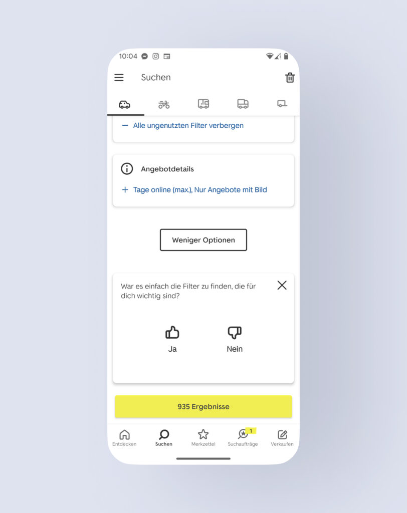
The feedback was captured by the feedback widget at the end of the filters. It was a great way to capture user satisfaction.
The question was “Was it easy to find the filters that are important for you?”.
New users
Returning users
Beta phase launch rollout to all users and expansion to iOS
This gave some a great level of confidence to wrap up the test and go for a BETA phase launch on Android and roll out the new design to all users (without the option to switch between the two designs).
Most importantly, it also gave the green light to start the project on iOS. Until now the two platforms did not have the exact same design approach and filter capabilities. This would allow us to have the same design on both platforms, reflect user complaints and wishes, allow more scalability of the search screen for our strategic goals.
The new design and filter logic I set up made it easy to start the iOS project with little customization as well as to include more vehicle types. The team released 4 more vehicle types in great speed. 3 of them were never available in the apps before.
Recap of the achieved goals and improvements
Reflecting on the accomplishments of this project, as a member of the Android Connect team, we take immense pride and satisfaction in the successful implementation of the new search feature. The new search not only offers a modern and visually appealing interface but also empowers users to build faster and more intuitive searches.
It was a great example of team effort, perceverence from the product manager side to keep investing in this project, huge development efforts from the dev team, a lot of design work for the different cases, vehicle types, set-reset filters and immense QA efforts from my side as I was the main tester of the filters. Additionally, I diligently managed stakeholder involvement, ensuring all relevant parties were kept informed and engaged throughout any changes or improvements. I was at the moment also supporting the web team with design work for the filters to ensure consistency sonce they were ready to adopt the new design.
For future improvements, monitoring the feedback from the feedback widget and the app stores reviews along with monitoring our key metrics (leads, saved searches) and health metrics (favourite, number of searches per lead) is how we will improve the search in the future.
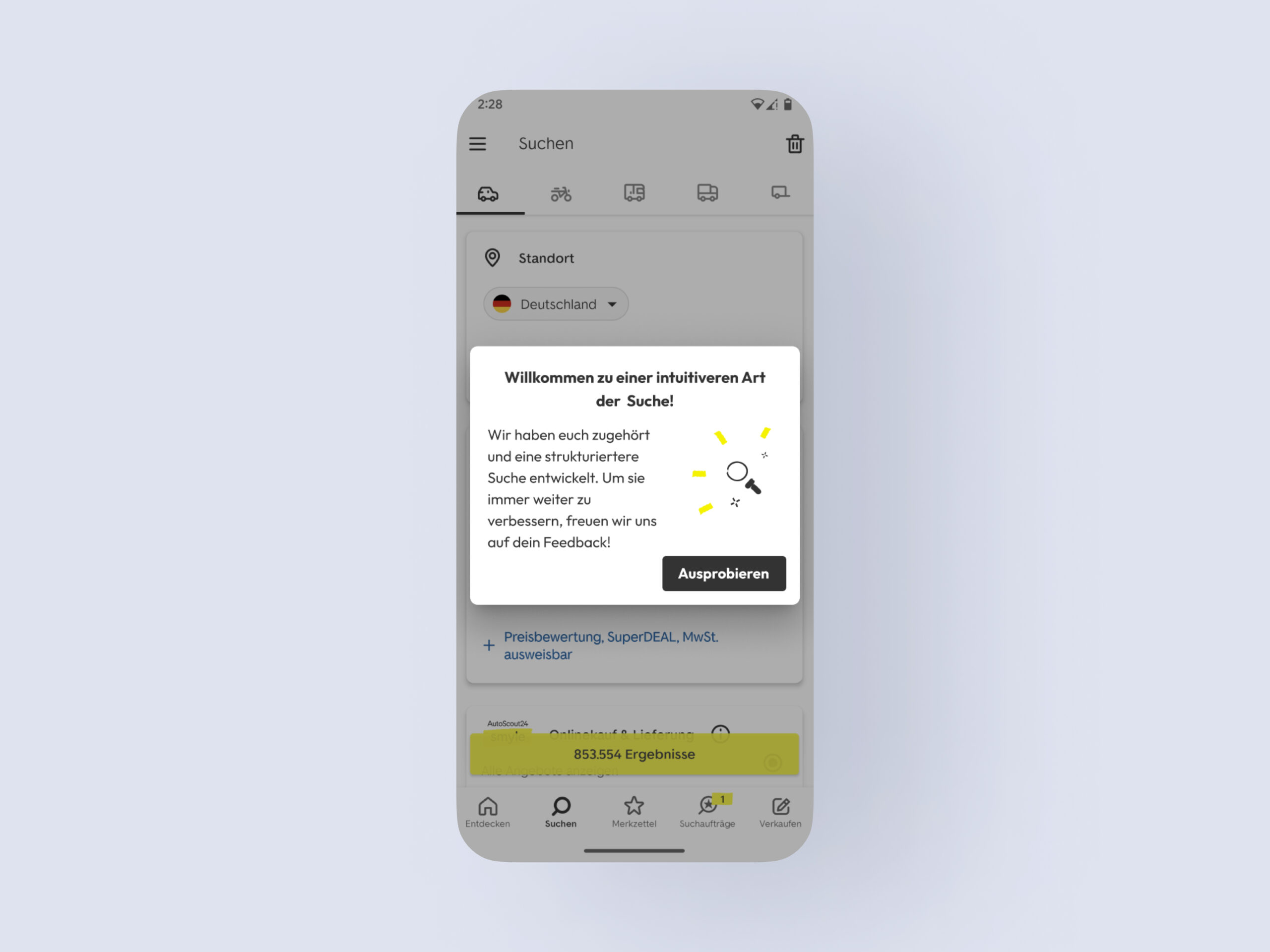
To introduce the new search to our users, we welcomed them with a message that highlighted their contribution via their feedback and we also invited them to share feedback - via the feedback widget.
New search in Android - light and dark mode
New search in iOS - light and dark mode
Designed & built by kerry.gr