logo_material-01-01-01

iGuide Website

Project 

iGuide Website 

Role 

User Experience Design

Web Design

Team

UI/UX Designer

Front-End Developer

Back-End Developer

where

Athens Information Technology

year

2014-2015

I was in charge of the website meaning I was responsible for the research, interaction design, visual design, copywriting and branding. Produced deliverables and did presentations to the stakeholders. Make sure to check the reflexion part at the end of the page.

What's iGuide?

iGuide is an online crowdsourced touristic system that offers valuable information about undiscovered historical and natural gems of Greece in order to enrich the travel experience and to create a community.

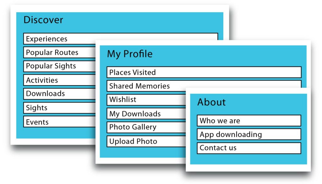
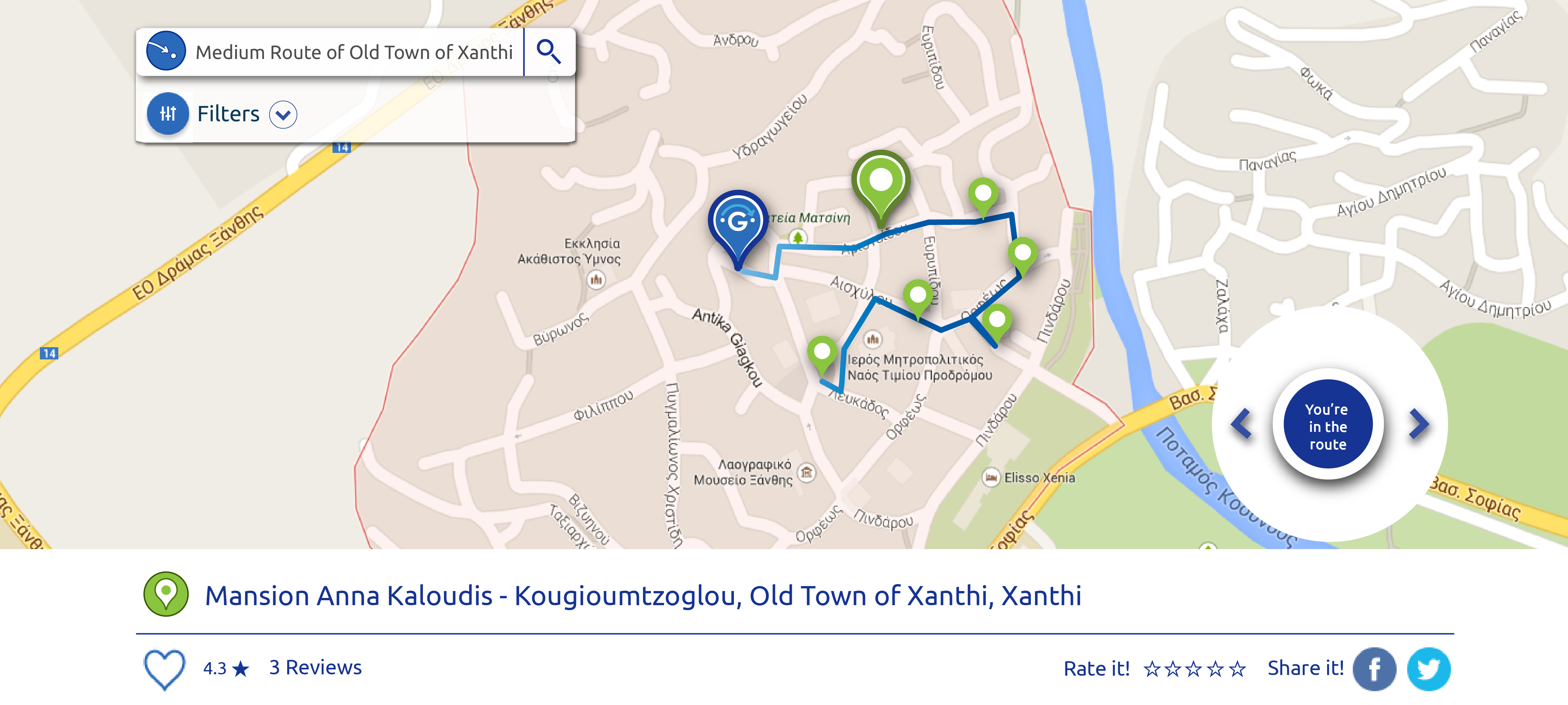
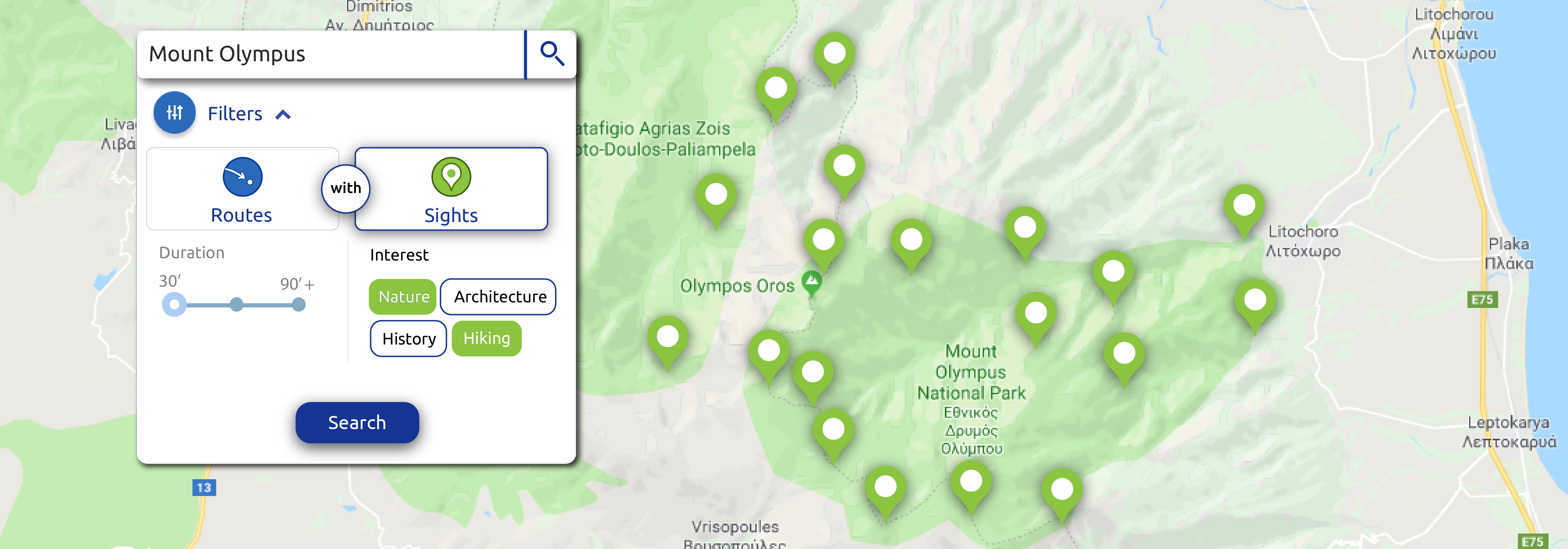
Explore points of interest

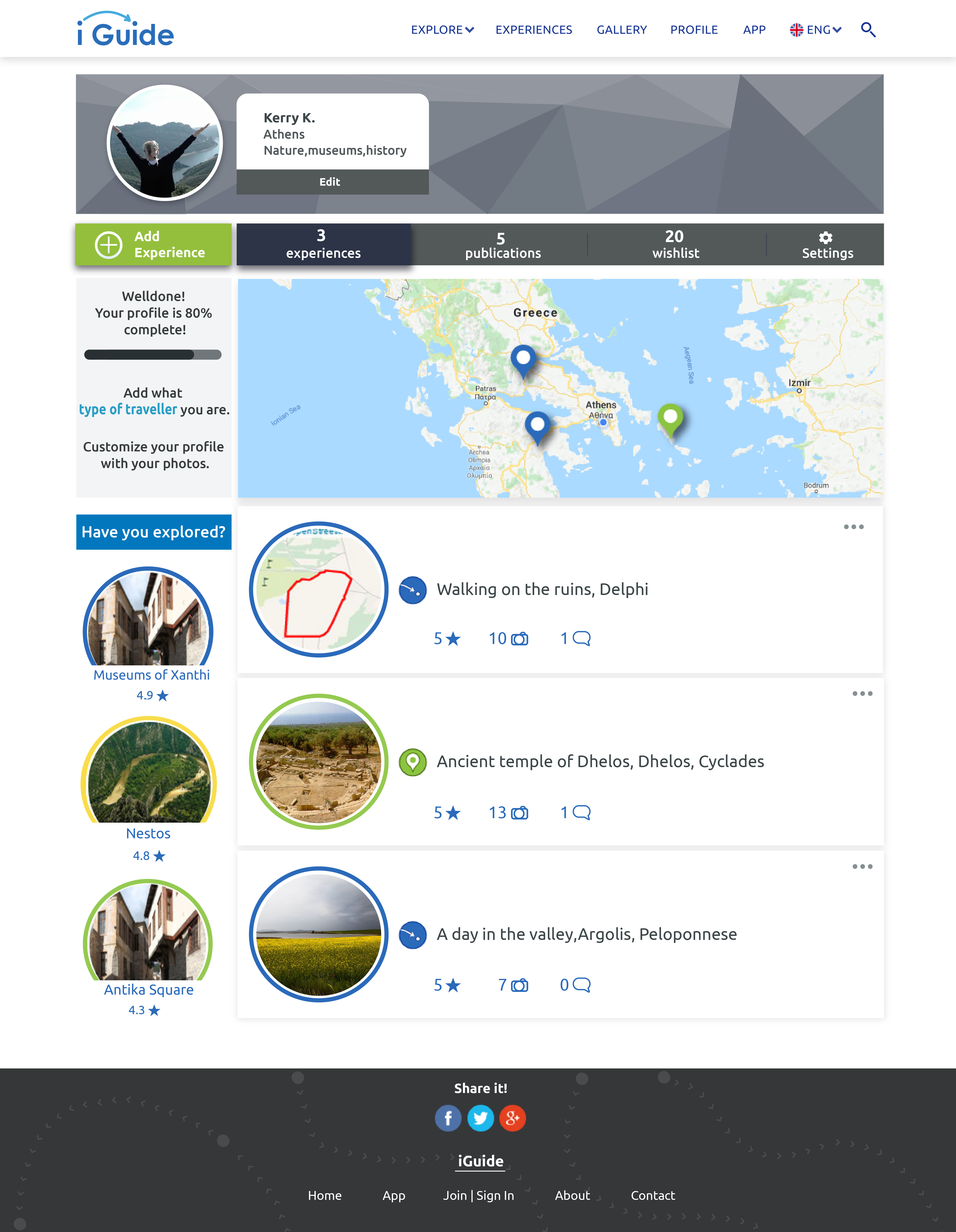
Using the iGuide website discover unexplored areas and their hidden routes,create your profile and start the adventure.


Download the app

Download the iGuide app to accompany you to your trip.


Listen to their story

Let iGuide offer you a tour just by following a route.

First things first


Meeting with the team that was building the app and with the repository team who was handling the data was a key point as we managed to set clearer the expectations and the challenges and have a shared vision.

Design Process

Empathy
Requirements
Prototyping
Usability Testing
Final Screens
Usability Testing

Empathy

participants on the survey
67
interviews with touristic services providers
personas and scenarios
user experience maps

Gathering the data from the survey, the interviews, studies and reports of the travel industry we came with the three dominant personas.

The personas and the scenarios served to form the User Experience Maps, who visualize how we imagine the use that our personas would do of iGuide.

In the Competitors Analysis the focus was on usability and the importance of user generated content and social proof. There wasn't any direct competitor but more like some sites with some of the features we planned to have.

Requirements

Based on the business goals, the competitive analysis and the research we gathered all the requirements and did a prioritization of requirements using the MoSCoW method to the functional and non-functional requirements.

Information Architecture with Optimal Sort

Using the Hybrid categorization option we created 16 cards with the possible menu choices and 3 basic categories.Users could also create categories. 9 out of 10 users completed the card sorting and 64% of them did this sorting. The result was confirmatory to our own categorization and gave as a direction to follow.

Prototyping

Many versions of wireframes were produced untill we got to medium fidelity mockups based on the requirements and the card sorting. With these mock ups I made an interactive prototype in Axure and run a usability test.

SITEMAP MOCKUPS4

Usability test on interactive prototype

We ran a usability test in the office with 5 people,aged 25-40, all of them were represented by 2 of our personas.
The goal was to test the navigation and the information architecture, the copywrite and the general visual approach.
The users had 2 main tasks to complete using the interactive prototype. The participants were encouraged to talk according to Think aloud protocol. The session were recorded, notes were taken and I was observing according to the Fly-on-the-Wall method.
After the end of the session we had a little discussion on the challenges they had.
The records were then analysed qualitative and the problems were to handle on the next design iteration.

Table with results after content analysis

Final Screens

Homepage

Route

Tour in the route

1

Click the button 'Start the route'

2

Use the arrows to see all the sights of the route

States of the filters on map

Profile

Sign in

Fonts

Colors

Icons

Usability test

participants
minutes sessions
15
tasks
post-tasks questions


I conducted an onsite usability evaluation using a live version of iGuide located on my laptop. The session took place in an office of the company where we had privacy. 6 employees of the company,that matched the profile of our personas, were asked to participate.

Each session captured navigational choices, task completion rates, comments, overall satisfaction ratings, questions and feedback. A full report of the evaluation was written based on the template of usability.gov.


Objectives of the usability test

Evaluation tasks

Table with Task Completion Rates

Some of the findings

Task 1 Join iGuide

Researchers's comments

Participants found easily the link Join/Sign in in the central menu. In this task, for error is considered the wrong input of data in the fields. Of the 6 participants only one filled successfully the fields. The rest of them automatically started filling the fields without reading the data required in each field. The first field was asking for Name and Surname ,and the second for Username. The result was that in the first field they put the name and in the second the surname and when they reaches the password field they found out that they hadn't put username and started checking the fields.
That ringed the bell to us to change the fields as it shown that users are used to fill the fields in this way.

Task 3.2 Start the Full route in Abdera and download the area

Researchers's comments

3 participants didn’t see the button ‘Start the Route’
1 participant took long to find it
2 found it immediately
All users found the button Download area.

The button Start the route after the evaluation undertook an immediate redesign.

Task 3.3 Listen the description of the sight Episkopikos Naos

Researchers's comments

3 participants searched immediately in the sights of the route
1 searched on the map,couldn't find it and used the search which returned the sight
1 searched the pins on the map using hover until he found the sight
1 used directly the search and found it

We understand that the use of the search and the map are on the top choices of the participants,rather than the page Sights.

All users found easily the button Listen to hear the description while browsing the page.

Table of Results of the post-task questionnaire

A new questionnaire was developed based on the categories of the QUIS but with more focused questions on our system . A 10 points Likert scale has been chosen as we wanted really subjective reviews, with 0 meaning None and 9 meaning too much.
For the results we based the percentage agree on the median rating as it's based on the frequency of a rating rather than the extreme rates that affects the mean rating.

Overall metrics

Pleasant
83.3%
Easy to use
94.4%
Interesting
94.4%

Recommendations and the necessity to build them

For every task participants were free to give their feedback and most of the times it was really natural to make suggestions.
All these suggestions were categorized per task and were given the severity they have to be build in the future meaning if they are crucial to the operation of the site or no. The severity differs among high,medium and low.

Task 1. Sign Up

The majority of the high severity changes were addressed working with the front-end and back-end developers.

Reflexion

In this project I had the liberty and chance to practice user experience design, the only pitfall was the limited to none resources. This put some limitations to the process but I tried to work it out with 
-the best free tools I could find
-search inside the company to find the participants that best match my personas
-evangelize user experience to stakeholders and tried to include them in the process.

For me it was very educative as 
-I dealt with a very big project with large amount of content.
-I worked with in-house and remote developers , project managers, other companies, a lot of stakeholders ,some of them not willing to hear the findings or be open to suggestions.
-I wrote many deliverables.
- I had to advise the team who was designing the app
-the process was challenging with changes over changes when something couldn't work in the code.
-I dealt with some already taken decisions that were affecting both the UI and the UX of the platform but I went with the flow.
-I learned new software.
-The time didn't let us finish the whole project ,so some of my designs weren't build and that's OK.

What my team says about me

Click edit button to change this text. Lorem ipsum dolor sit amet, consectetur adipiscing elit. Ut elit tellus, luctus nec ullamcorper mattis, pulvinar dapibus leo.
Sofia Tsekeridou
Senior Research and Innovation Manager
Click edit button to change this text. Lorem ipsum dolor sit amet, consectetur adipiscing elit. Ut elit tellus, luctus nec ullamcorper mattis, pulvinar dapibus leo.
Iakovos Georgiou
Software Engineer
Click edit button to change this text. Lorem ipsum dolor sit amet, consectetur adipiscing elit. Ut elit tellus, luctus nec ullamcorper mattis, pulvinar dapibus leo.
Katerina Pechlivanidou
Software Engineer

Design for Happiness

Designed & built by kerry.gr